 |
| Image from: http://www.irealm.org/d-art/full/bwbutterfly.jpg |
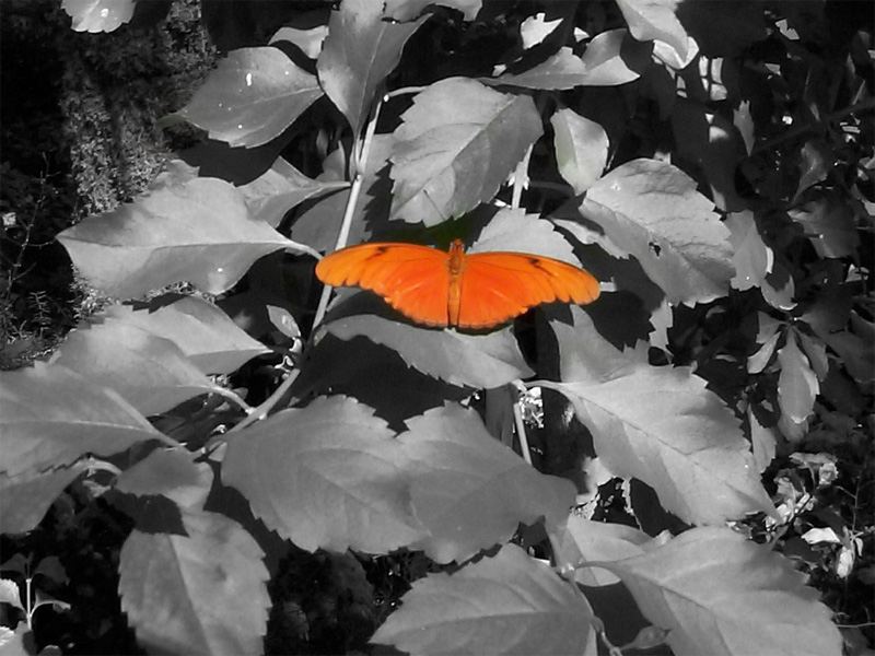
The use of color in a design can help bring out a number of different design elements. Just like in the picture above, the color helps create contrast between the background and the subject. If the whole image were to be black and white then this same contrast would not occur. Sure you would have a decent amount of value if the whole picture were to be black and white but your eyes would not go to the butterfly the same way they do now because of the color. The use of color creates contrast and also helps create a focal point to the picture. Notice how the focal point of this image is slightly off center. This focal point would not be created if it wouldn’t have had the color it does now.
As stated by Josef Albers, in Interaction of Color, “Color, when practically applied, not only appears in uncountable shades and tints, but is additionally characterized by shape and size, by recurrence and placement, and so on, of which particularly shape and size are not directly applicable to tones.” (Albers p. 40). In this case the color applied to the butterfly has different tones but not as many as Albers suggests. This picture appears to be photoshoped and one thing that it lacks is the variety of tones that come with the addition of color. If more tones were visible on the butterfly then this would make the picture much better, just like Albers suggests when applying colors you must do so practically.
No comments:
Post a Comment