Sunday, November 28, 2010

Utopian Design: Solar Power Panels

Image from: http://media-2.web.britannica.com/eb-media/45/99545-004-404C20FE.jpg

         In today’s society solar panels aim to improve society by directly converting sunlight into electrical energy. From homeowners to businesses, people in society have switched to solar power because they know it is better for the environment and also because solar power is free. Since solar panels do not have any moving parts that use fuel or need maintenance they are very convenient and can be used in remote parts of the country. To further understand how solar panels are benefiting society we must explore its design further.
The light from the sun enters the solar panel through the antireflection layer which minimizes the loss of light due to reflection. Then this light travels to the energy-conversion layers that are below the antireflection layer. The light then goes through three conversion layers which are the top junction layer, the absorber layer, and the back junction layer. Then two additional layers are needed to transmit the electric current out to the external load and then it goes back into the cell. After the light completes this process then the electric circuit is complete. Below is a picture that shows where each of the layers are located.

Image from: http://media-2.web.britannica.com/eb-media/30/330-004-F78C467F.gif

           Solar panels are arranged into larger groups called arrays. These arrays are what we see on top of the roofs of homes and businesses. Businesses like Kohl’s use solar power to power most of there store’s power.  Solar power is not only used in panels to power homes and businesses, but they are also used in toys, calculators, and portable radios that are not only powered by sunlight but can also be powered by fluorescent lights

Color Transforms Design

Image from: http://www.irealm.org/d-art/full/bwbutterfly.jpg

            
            The use of color in a design can help bring out a number of different design elements. Just like in the picture above, the color helps create contrast between the background and the subject. If the whole image were to be black and white then this same contrast would not occur. Sure you would have a decent amount of value if the whole picture were to be black and white but your eyes would not go to the butterfly the same way they do now because of the color. The use of color creates contrast and also helps create a focal point to the picture. Notice how the focal point of this image is slightly off center. This focal point would not be created if it wouldn’t have had the color it does now.
            As stated by Josef Albers, in Interaction of Color, “Color, when practically applied, not only appears in uncountable shades and tints, but is additionally characterized by shape and size, by recurrence and placement, and so on, of which particularly shape and size are not directly applicable to tones.” (Albers p. 40). In this case the color applied to the butterfly has different tones but not as many as Albers suggests. This picture appears to be photoshoped and one thing that it lacks is the variety of tones that come with the addition of color. If more tones were visible on the butterfly then this would make the picture much better, just like Albers suggests when applying colors you must do so practically.  

Dangerous Design: The InStyler

Image from: http://www.ititbuyit.com/images/2010110408.jpg

          
             The InStyler is a rotating hair iron made by Tre Milano, LLC. This hair iron is not like any other hair product out there in the market today and the reason might be that it is a very dangerous product to use. Last Christmas my sister received the InStyler as a gift and she was very excited to use it because after seeing all the infomercials on T.V. she thought that it would work perfectly. As soon as my sister received the InStyler she decided to give it a try only to find that it was extremely hard to use. She even burned her ear because the rotating cylinder gets really hot. There have even been YouTube videos that say how dangerous this product can be. The following link is to a video about a woman who bought the InStyler from QVC and received an attachment for the InStyler in order to reduce burns.

                                      http://www.youtube.com/watch?v=kLlUMbCS-RQ

            This is evidence that the InStyler is a dangerous product because it was worth it to QVC to send an additional protective shield for free to their customers in order to prevent burns. To really understand why this is such a dangerous product one must analyze the design further.
            The InStyler reaches very high temperatures just like any other hair product but the major difference is that since the InStyler has a rotating cylinder it is harder to maneuver when you are using it to straighten or curl your hair. The rotating cylinder was thought to be a great innovation to the design of this model because this allows you to both straighten your hair or curl it but by doing so it creates the unintentional danger of having an unprotected hot rotating cylinder really close to your head and fingers. I am sure that the designers of this product were only thinking about the efficiency that the cylinder would be to the model and didn't realize the possible dangers it could have. When designing something a designer must always think of the possible dangers to the consumer their product might bring. I would have to argue that the normal straighteners are safer to use because both of the sides are covered with a protective heat metal that allow you to put your fingers on one side of the straightened in order to close it. The following is a picture of a regular hair straightener.

Image from: http://www.myhairstylingtools.info/images/CHI-Turbo-2-Big-Flat-Iron-1.jpg

            This straightener is much safer because both of the heat plates are surrounded by protective metal that if you touch is still hot but not hot enough to burn you the way the InStyler can.

Monday, November 15, 2010

The Importance of Design at a Young Age

Image from: http://smythek6-trusd-ca.schoolloop.com/cms/page_view?d=x&piid=&vpid=1235051466140
           
           As I was working on my homework my 10 and 11 year old cousins were discussing what electives classes they were going to pick. This surprised me because when I was in elementary school I never had a chance to take electives in elementary school. At Smythe Academy, a public elementary school in Sacramento, students as young as the first grade are able to sign up for elective classes that range from the arts to cooking. I feel that some of the art programs that Smythe offers really do get kids interested in the arts. Some of the classes that Smythe offers are Recycled Art, Pointillism, Art in the Fall, and Drawing. I feel that every kid should get the opportunity to take art classes just like the kids at Smythe. Whether kids choose to pursue a career in art or design, or they are just looking for a hobby, art and design classes are essential to every kids learning. Even though I didn’t have elective classes in elementary school, I was lucky enough to have a graphic design class in high school. This class inspired  me to pursue  a career in design  and  I fell that if I wouldn’t have had this class I wouldn’t decided to major in design . This is why I fell that it is important to make art and design classes available to kids at a young age so that they can decide if design is a career they want to pursue.  

Ergonomic Design of a 2011 Mustang GT Continued


Image from: http://www.fordvehicles.com/resources/ford/mustang/2011/featurecategories/mst11_feat_perf_50engine.jpg
            
            As far as performance goes the 2011 Mustang GT has a new engine that delivers even more power than before while still providing the best fuel efficiency. The new 3.7L V6 engine gives you about 31 MPG on the highway. The 2011 model also comes with cold air induction which increases the horsepower and torque. This new model also comes with a 6-speed transmission for a smoother ride. If you choose the sport mode you could get Advanced Trac with ESC which allows you to push the vehicle more without loosing control.  
            The 2011 Mustang GT has a unique look compared to other cars. The outside design of the Mustang GT is designed with the human features in mind especially the front of the car. The front of the car tends to look like a human face, with the headlights for eyes and the grill for a mouth. For the nose it has the iconic pony grille or “hockey stick”. The lines that run on the side of the car give it depth and when the light hits the lines it creates a shadow. This shadow creates a sharp contrast between the color of the car and the dark shadows. The 2011 Mustang GT comes in eight colors which are race red, grabber blue, red candy metallic, performance white, kona blue metallic, ebony, ingot silver metallic, and sterling grey metallic. These colors allow many to be pleased with the new 2011 Mustang GT.
           

Ergonomic Design of a 2011 Mustang GT

Image from:http://2011-mustang.com/images/2011_mustang_gt_4.jpg
The 2011 Mustang GT is a vehicle that has many features that can be analyzed. As far as safety goes the 2011 Mustang GT is relatively a safe car. It’s equipped with air bags and comes with Ford’s Bumper-to-Bumper Warranty. It also comes with complementary Roadside Assistance coverage for up to 5 years or 60,000 miles, which ever comes first. The 2011 Mustang GT is equipped with many comfortable interior features that please the consumer. These features can include leather seats (available in 5 colors) with switch-selected heat, ambient lighting (available in seven colors), and map pockets on the back of the two front seats for your convenience. Another important feature that the 2011 Mustang GT comes with is SYNC. SYNC allows you to make hand free phone calls, control your music via voice commands, view traffic, get directions, and even allows you to make audible text messages. Also when you purchase the 2011 Mustang GT you will also receive a navigation system with a 6 month SIRIUS Traffic and Travel Link that easily allows you to navigate through traffic and also gives you local fuel prices, weather information, movie listings, sports scores and schedules. The vehicle can also come with a rear view camera perfect for when you are backing up. All of these features are relatively easy to use. Driving a car in general is easy to learn. If you need help learning how to drive you could always go to a driving school to learn how to drive. They explain all the rules of the road really well and once you get your permit they also teach you how to drive.

Monday, November 8, 2010

What is Art?

             Art can be virtually anything, so how do we know what’s art and what’s not? Some believe that art should be an amazingly beautiful work that has a tremendous impression on you because of its immense beauty. This idea that art is suppose to be beautiful is the concept of aesthetics. So if art is suppose to be beautiful then what about Yoko Ono’s artwork One Piece?

Image from: http://florica.files.wordpress.com/2007/11/m0705211516551_p1.jpg
            When talking about Yoko Ono’s One Piece we should also consider the idea of ethics and how ethics affects art. When an artist decides to create an artwork like One Piece 95% of the artists are concerned with ethics. They are worried if it will be accepted within society. So Yoko Ono’s One Piece is considered art because art is not just beauty but it is also about conceptualizing. Conceptual art is where the idea behind an art piece is more important then the object itself. It the object isn’t beautiful but it makes you think then that is art! Art doesn’t necessarily need to be beautiful but as long as it makes you think about something then the artist has done their job. Not all art will make you think because some art is just meant to look beautiful and that’s it but most of the time an artist are trying to deliver a message just like in design.

Sunday, November 7, 2010

Words and Images in Graphic Design

            The combination of words and images can be found in the simplest form of advertisement. Whether you are creating a poster or an ad for something you want to sell, words and images must come together to convey your message.
            Many graphic designers design advertisements that have a balance between words and images. This balance is important because it is what separates a good design from a bad design. As in comics, graphic designers use pictures to express situations that words can’t and then the words can express something that the audience may not get from just looking at the picture. Images are used by designers to convey emotions and moods, while words are used to convey a message. There are few cases where an image is the only element that is conveying the message. Most of the time designers rely on both images and words to express a message. Words like pictures can be changed to appeal more to an audience. For example you can change the font, the color, and the size of the text in order for the words to more accurately display your message.
            Logos are particularly important in a designer’s world because they use images and words to represent an idea or an identity. Just like in the Coca-Cola logo we see a combination of an image and words to attract an audience’s attention. 
Image from: http://www.pycomall.com/images/P/Coca-Cola_logo5.jpg
This logo is not only used to advertise for Coca-Cola but it is also used as the company’s identity. So how can this logo convey a message? This logo to me makes me want to drink a Coke because the logo is telling me that I will enjoy this cool and refreshing drink. Some of the elements that tell me that this is a cool and refreshing drink is the ice on the upper left side of the logo and also the drips of water that are randomly splattered all over the logo. This logo truly represents how something as simple as a logo can have a powerful message that may just make you buy their product.

Word and Image as Presented by Brian Fies

           On Nov. 2, 2010, Brian Fies, the author and illustrator of Mom’s Cancer and Whatever Happened to The world of Tomorrow? presented to our Design 001 class. I really enjoyed his presentation because he was completely honest and he also gave us some tips and ticks for when we become professional designers.
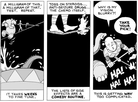
            One of the many useful design elements that Fies talked about was how words and images work together to communicate effectively. This is especially true in comics where if you don’t have the words to the picture you couldn’t understand the message and vise versa. Pictures tell you a lot so the words you read can say something else. Fies compared the words and pictures in comics to the words and songs of rock music. He said that you can take bad lyrics to rock music and combine it with a song to produce a song that many people will enjoy. Similarly, Fies said that you can take a mediocre writer and a mediocre artist and together they make a good comic artist. As Fies pointed out, the language of comics allows one to communicate differently because the words could be dead serious while the pictures could be ridiculous. Through comics the author is allowed to use metaphors to illustrate drama and conflict in a ridiculous way. 
Image from: http://static.guim.co.uk/sys-images/Guardian/Pix/pictures/2010/7/14/1279113726938/Moms-Cancer-comic-by-Bria-001.jpg
Just like here when mom is waking on a rope and there are alligators underneath. The words on the other hand are not describing the pictures but they are telling a story, which the pictures help bring out in a ridiculous manner.
            Another element that Fies analyzed was how in a comic you are allowed to play with space and time, in where time passes very quickly or not at all.
Image from: http://www.helenjaques.co.uk/wp-content/uploads/2010/03/Moms-cancer-300x222.jpg
Here we see that a lot of time has passed and this is mainly due to the pictures. Sure the words have a lot to do with it like the reason behind the cancer but the pictures are our dead give away that time has passed.
            Fies did a great job in explaining the terms and concepts that I read in Scott McCloud’s book Understanding Comics. I feel that his examples really added to my previous knowledge that I had about comics.


Monday, November 1, 2010

What is the job of a designer?

           In today’s society a designer has many responsibilities. They must work with constraints to create a design that both solves the problem and will be pleasing to the customer. When doing so a designer must understand what people need better then they do. This requires the designer to do research in order to find the extremes of the spectrum of people that use that product. They must also study human-object relationships in order to create a successful object. Ultimately a designer must look to the future and this often requires looking to the past as well to get people to buy things that already exist, but have a new design that pleases the customer more.
Image from: http://www.maserati.com/mediaObject/COM/models/mcconcept/GT%20MC%20C_2453/resolutions/res-694x384/data.jpg
              If we take a look around us most objects have human characteristics. If you have looked closely at cars you will notice that they often have a face. Designers do this on purpose because for the consumer an object that resembles human characteristics is often more pleasing to them.
            Another element that designers must consider is if someone would pay money for an object designed a certain way. They must ask themselves would people buy this or would they spend money on this? While thinking of this designers always strive to design something that gets better with time. These types of designs usually cost more but there are times when bad designs are equally as expensive. Designers must always be looking to trends but at the same time they must also think critically about the problem at hand.

Analyzing an iPod

Image from: http://www.megaleecher.net/uploads/ipod-nano-chromatic.png
          When we look at an iPod we typically don’t analyze it in terms of its design. Normally when we look at it we just notice the color and know that it plays music. When we look at something like an iPod we must stop and ask ourselves why is it designed this way and what were some of the thoughts designers had when they were designing the iPod?
            If you look closely the elements of an iPod are all unified. This means that all the elements seem like they belong together. You might think that the white circle that has the menu options on it might be out of place but this is just because the white circle offers a nice contrast against the colored background. This contrast grabs your attention and draws you to the iPod. The iPod is also a very balanced object because the screen and the white circle are placed in a way that dissects the iPod into two parts. If you only had the screen on top with no white circle on the bottom then that emptiness would create imbalance. This distribution of weight on either side of the horizontal axis creates balance.
            To further please their clients apple designers decided to create iPods in various colors. As I was analyzing the iPod I noticed that each iPod just has one solid color. There is no value or shading that manipulates the iPod but I think that these effects would just complicate the design. The simplicity used in this design has a lot to do with the fact that the iPod is just one solid color and here this simplicity works.

Interaction of Content and Form in Objectified

          In Objectified, a film by Gary Hustwit, everyday objects are analyzed on their form and content. Content is basically what the artist what’s to communicate to the viewer. While form is how the object looks through manipulation of elements and principles of design. Form and content go hand in hand because sometimes “form is determined by content” while other times “…form [can] work in unexpected ways to express content” (Lauer pg.10-11).
What we saw in the film objectified was objects like a potato peeler being analyzed in terms of content and form. We normally would not think a potato peeler needs to be designed in any specific way other than what it is designed to do and we don’t think of whether or not that design is appropriate. Designers look at products and ask themselves how can I make this better? When doing so designers must look at extremes not necessarily the average person that buys the product. When the extreme sides of the spectrum are satisfied then the average will be too. A potato peeler must do its job but when these designers came up with the new design they also asked themselves is the form of the peeler comfortable to use. The answer was no. So the designer’s job was to come up with a solution to this problem. When they did, both form and content coexisted to satisfy the needs of everyone who uses a potato peeler. So you see, form and content are an essential part of the design process.